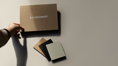
 Looking for the perfect colour? Order samples
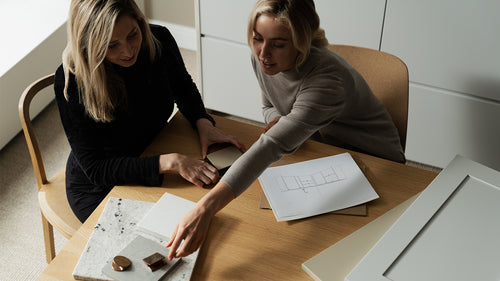 How to buy a kitchen? Read our guide
 Explore free standing wardrobes
 But free standing wardrobe
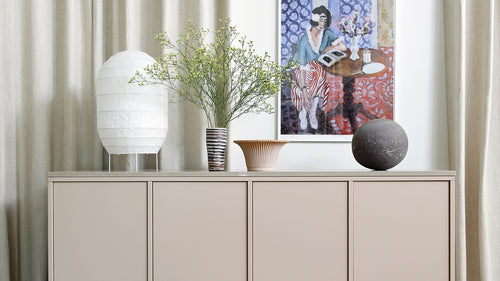 Get inspired – explore sideboards
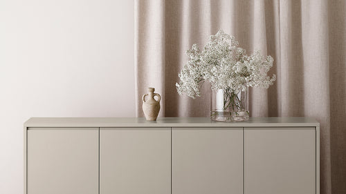 Buy sideboard
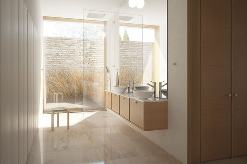 Buy bathroom vanity
 Colour sampling without painting: Adhesive swatches
 Your life in colour - read our painting guide
Colour Blocking - Transform your space with colours
The colour-blocking trend is a welcomed alternative to the classic style. It encourages you to realise your style. Look at your home with new eyes and create three-dimensional worlds with your favourite colours.

Colour blocking challenges you to see your own home in a new way. You can create different spaces in the room and emphasise or tone down parts of it by painting the walls. Our professional partner, master painter Paula Rautiainen, often designs personal color schemes for her clients. She encourages people to look at the bigger picture rather than painting individual accent walls.
“Modern color blocking is a fresh choice after the accent wall boom. It’s a timeless style, even though it’s very trendy at the moment. The most important thing is to focus on the bigger picture while making the plan. There’s no point in painting one wall here and there.”
A muted green creates a calm atmosphere and is perfect for sectioning out a working space. Try the colors Lichen Green or Water Green.
Picture by @benanders
It’s good to look at the room with new eyes when planning how to use colour blocking in your interior. Could you split the room into different colour zones based on its use, accentuate the architectural lines of the building, or perhaps the hallways? What role could the often forgotten ceiling play in the interior?
“Take the idea further by looking at the room as a whole if you already have an accent wall at home. Could you perhaps use the same colour on the skirting board, window sills or door frames?” says Rautiainen.

You can create layers and depth in the bedroom with a darker color. Try our Baltic Blue or Gustav Blue.
Picture by @colinking
Look for inspiration for how to use different colours from, for example, modernist architects and artists. Le Corbusier and Piet Mondrian are a couple well-known representatives of abstract colour use. They both study the built environment and colours by questioning familiar patterns of thoughts. Another place to look for ideas is colour theory. It can also help you gain a better understanding of the optical illusions colours create.
The post-war Miami modernism represents a more light-hearted play with colours. This style usually combines bold shades with pastels. It makes it easier to use the colours in other places than just on large walls. They can, for example, be added to the ceiling, on window sills, doorways, and around doors. You can also emphasise the three-dimensional impression in the room by switching between strong and subtle colours.
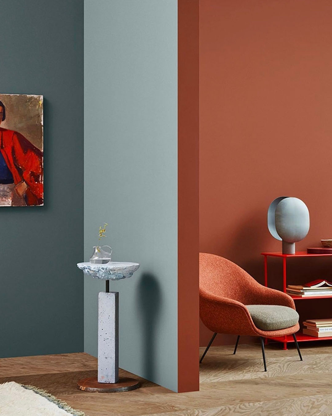
Incorporate more colour into your interior by painting the doorway. Eliel Red, Water Green, and Petrol Blue are lovely options.
Picture by @gubiofficial
“I usually choose one main colour and then pair it with a lighter or darker shade of the same colour. It creates a harmonious atmosphere,” says Rautiainen.
Another tip is to combine a bold accent colour with two other shades and use it on the smaller surfaces in the room. You can also plan the colour scheme and see which ones work together by making a collage of colour swatches.
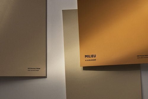
Order colour swatches and start planning colour blocking with the Milieu shades.
